
Light Fabrication Exercise & Instructional Kits for Kids
Project Overview
Phase 1: Create a prototype of a light using mixed sheet-based materials combining manual and computer-aided fabrication.
Phase 2: Open-ended prototyping project that involves at least two rounds of user testing.
Context
Carnegie Mellon University, School of Design
Prototyping Lab, Spring 2022
Role
Product Design, Content Creation, User Testing, Desk Research, Presentation Execution
Duration
Phase 1: 4 weeks
Phase 2: 3 weeks


Phase 1: Light Fabrication
I initially started with a lantern that mimicked the design of a shoji - a room divider used in traditional Japanese architecture. After working through the lo-fi prototype, I realized the interaction was not coming together as intended and there were structural issues. Given the time constraints of this project, I ultimately opted to pivot and move forward with a different design.
I found new inspiration through revisiting old photographs I had taken while traveling and allowed my concept to be inspired by this imagery. In tandem, I researched different types of flat-pack lighting to guide the form.
I was ultimately inspired by the design of the 1960s Futuro house, one of which I had seen while traveling through Texas.

Process
I created and tested a few different forms using a combination of 3mm and 6mm plywood. I also cut circles out of colored cellophane to attach to the wooden arms of the light for a pop of color, in line with a 1960s aesthetic.
The main aspect I struggled with was getting the measurements of the cutouts to be the right width to allow for seamless fabrication. I wanted to be able to attach the light parts together without glue but ultimately, although I found the correct measurements, adding the glue was more stable and reliable.
Overall, I am happy with my final prototype and I achieved what I set out to do given the constraints of this project. That said, I would love to explore another version that included colored shapes turned flat against the light source to allow the light to cast through the colors.

Phase 2: Instructional Kits
In reaction to the second prompt, I opted to continue with my lamp design by prototyping a new element: fabrication instructions.
I was specifically interested in targeting children, particularly those that are differently abled. I aimed to design something that would be equally accessible for children who struggle with reading comprehension and language as for those who do not. My hypothesis was that by designing instructions for this user, they would ultimately be usable for all.


Benchmark Analysis
I kicked off my process by reviewing existing instructional kits for kids and familiarizing myself with the common language and formatting to use as a benchmark. I found that most kits use a combination of language and imagery, while a subset opt to use imagery alone. This led me to consider how I might create a set of image-only instructions to achieve my goal of accessibility for all.
I also noticed there were two options for the formatting of the instructions: showing one instruction per page or multiple instructions per page. I hypothesized that one instruction per page would be considered easier.
Beyond these variables, there were several design choices I knew I needed to include based on my analysis:
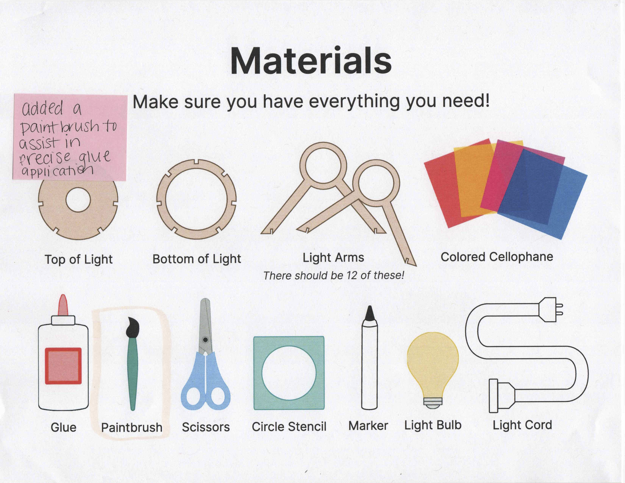
Materials page that depicts what comes in the kit and what you need to locate on your own at home
An image of the final product on both the cover and final page
Realistic imagery and color palette of the tools and materials
Development & Iteration
My analysis informed the creation of four unique sets of instructions along with a few additional variables to test as potential value adds:
Set one: Images only, one instruction per page
Set two: Images and text, one instruction per page
Set three: Images only, multiple instructions per page
Set four: Images and text, multiple instructions per page
I knew the most difficult step to communicate would be the moment when the first light arm is attached to the top and base, so I created 3 different formats to test within these master sets.
One thing I did not see that I wanted to test were progress-marking mechanisms. For the instruction sets that include multiple instructions per page, I included a check box to mark once a step was complete. My hypothesis was that this would help a user keep track of where they are in the midst of a visually busy page of instructions.
Testing
I set out to conduct three rounds of user testing with three different users. Given the time constraints of this project, each user experienced all 3 sets of instructions.
I tested each individual on their own and asked them to use the think-aloud method as they went through each step. The first round involved using lasercut cardboard prototype parts along with the image-only instructions, one instruction per page. If they got stuck, I then gave them the instructions that included images and text, one instruction per page.
The second round involved using lasercut plywood prototype parts along with image-only instructions, multiple instructions per page. Similar to the first round, if they got stuck, I then gave them the set of instructions that included text.
Since the users were seeing the same instructions multiple times, I decided to use a different material for the first and second rounds as an added variable that became increasingly difficult to fabricate.
Finally, our third round of testing involved a presentation and conversation over Zoom to review the final. setof instructions and changes made based on the insights from the testing sessions.

User 1: Mikey, Age 14
General interest in STEM-related cucciuclua
Frequently completes LEGO build kits

User 2: Ava, Age 11
General interest in arts and crafts
Struggles with reading comprehension

User 3: Nola, Age 9
General interest in arts and crafts

Insights
All participants were able to complete the task using image-only instructions, but all agree that having the text makes it clearer and therefore more enjoyable.
All agree it would be helpful to have a color-coding system to show which parts attach to each other.
The act of cutting the circles became a point of frustration for both Ava and Nola, but Ava explained that sometimes it’s nice for things to take longer if you don’t have anything else to do, and if it takes longer she will care more about the finished product. Mikey opted to layer his cellophane and cut multiple at one time.
Ava preferred seeing multiple steps on one page because it became annoying to turn the page so often and she felt it was easier to understand the current step by also seeing what was next. In contrast, Nola preferred seeing one instruction per page because it helped her stay focused. Mikey preferred one step per page because it’s what he’s used to seeing.
It’s important to add information about how much or how little glue should be used in steps where this is required. Each participant also opted to use a paintbrush to be more precise. Jumping off that, it is also important to indicate how precise one needs to be for each step, specifically, when cutting out the circles.
Having the ability to track progress was not a value add and felt more like a blocker than an aid.
Ensure all steps show items that have been made that are not in use.
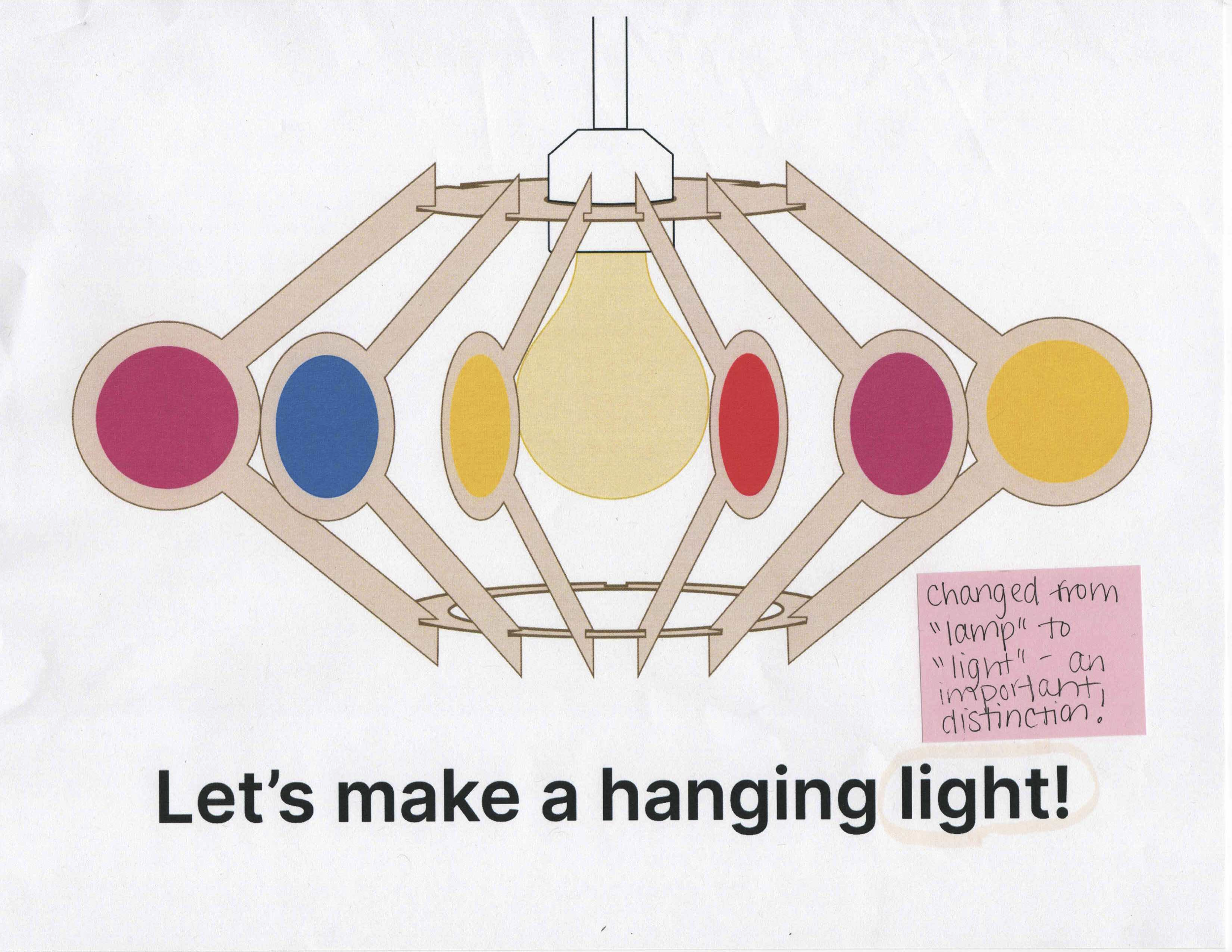
There is a clear distinction for all participants between the terms “light” and “lamp”, the word lamp, in this case, confused them and they would refer to it as a light.
Solution
See below for annotated set of final instructions:


Presentation
This project was presented during Carnegie Mellon University’s Design Week in May 2022.
In an effort to display my lamp in use and suspended for the final presentation, I fabricated a box frame using 6mm lasercut plywood. I added brass elbow brackets as supports and attached cutout circles as decorative elements that were leftover from the original light cuts.
For a pop of color, I watered down some blue paint to stain the frame.


Reflection
